Bubbaloo Rebranding Conept 2020
Art direction • Digital Art • Branding
Bubbaloo is part of Mondelez international and it is mostly known for its flagship product “pillow”, a gum with liquid center. However in recent years Bubbaloo is expand its market introducing new confectionery products. The task was to find a new look and feel for the brand to appeal to a larger audience while making it more relevant and modern creating a visual statement.

I started by creating 3 different stylescapes, based on the client's brief. The idea was to take this brand and make it more modern looking, bringing the colors of the products and making it fresh and trendy for young children. With the feedback in, the target age was modified and a new stylescape was created with a more teenager look to it.

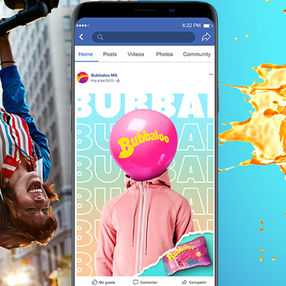
The final design featured bold typography, with higher contrasting colors with a mix of 2D artwork with some 3D product shots, which eventually turned out to become a full 3D product environment for the packaging.
The Bubbaloo logo
Part of the Bubaloo's rebranding included a logo redesign, To create a more vibrant look I began by stripping back unnecessary visual clutter while maintaining the boldness that makes the brand recognizable. The result is a modern identity with a fun and bold look .

Old logo vs New logo

Color and typography
The colour palette is vibrant and energetic and the typography weight has perfect legibility, creating a flexible design system with a bold and fun attitude.


Packaging
Each of the Bubbaloo products has its own unique qualities that create a different tasting experience from other brands. The idea behind the packaging was to create images using 3D renders to reflect these unique qualities. giving a visual representation to these attributes. The focus was to create graphics that were showstoppers different from anything in the category.

Pillows and lollipops
The Pillows and the lollipops both have a liquid center and we wanted do feature this quality. Polygon modeling was used with digital sculpting to create imperfections for a more realistic look on the exterior surfaces.
Fluid simulations were used to create the liquid and then refined with digital sculpting. For the breaking effect of the hard candy physics dynamics were applied to the 3d model to get a more organic look.
Complementary elements were modeled and digitally sculpted to represent a particular flavour, then added to the main fluid and hard surface model to create a final render.


MEGA gum
The main attribute of the Mega product is the size, and to make it more appealing soft body dynamics were applied to the main Peace Sans typography to create a chubby and fun look.
A gum shader was created for the type and complementary elements were placed for the final concept.


Crack-ups
The Crack ups product was a tricky one, as the main attribute was the flavour and color variety.
To represent this the Idea we decided to create a color explosion with 3D elements and a candy shader, putting special attention to the light to enhance the tastiness of the product.

This design proposal along with others ended up only as a concept for branding; as the client decided the rebranding brief would not continue to the production stage.


